MintyFi
Making personal finance feel less overwhelming, 88% task success rate

Project Overview
Type: Academic Project, a fintech venture pitch at MIT
Industry: SaaS, Fintech
Timeline: 8 weeks (2024)
My Role: Lead Product Designer and Researcher
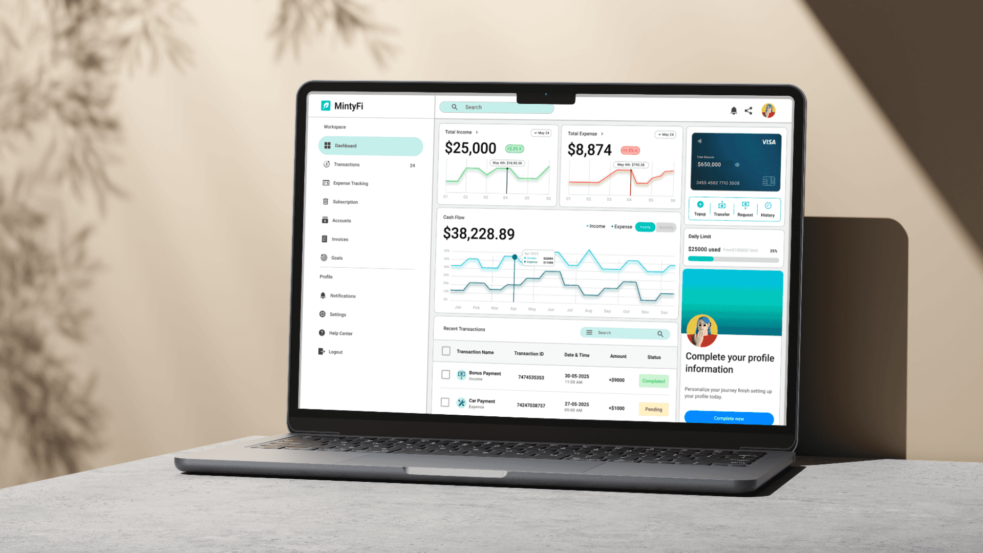
Most people know they're bad at managing money. The real problem is they don't know WHY, because their financial data lives in five different places, none of them talking to each other. I designed Mintyfi to fix that.
The Problem
Freelancers and small business owners manage their finances the same way they manage anxiety in reactive bursts, usually after something has already gone wrong.
Their income comes from multiple sources. Their expenses live in different accounts. Their "system" is a combination of spreadsheets, bank apps, and memory. No single tool gives them a complete picture so they fly blind.
Existing tools don't help. They force an impossible choice: accept oversimplification (and lose depth), or accept complexity (and lose time). Neither serves the modern independent worker.
The opportunity was clear: design a tool that adapts to the user's context instead of forcing the user to adapt to the tool.
User Research
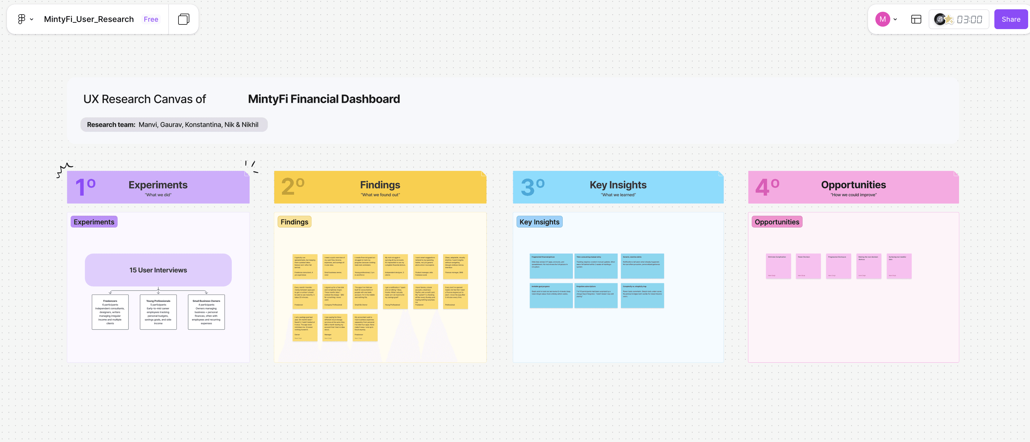
I led 15 ethnographic interviews with freelancers, young professionals, and small business owners across different income levels and financial literacy stages.
The method was deliberate: instead of asking what people wanted from a product, I asked how they currently managed their money. That distinction matters, people can't always articulate what they need, but they can always describe what frustrates them.
Six patterns emerged consistently:
Fragmented financial picture
Time-consuming manual entry
Generic, reactive alerts
Invisible goal progress
Forgotten subscriptions
Complexity vs. simplicity trap
Competitive Analysis
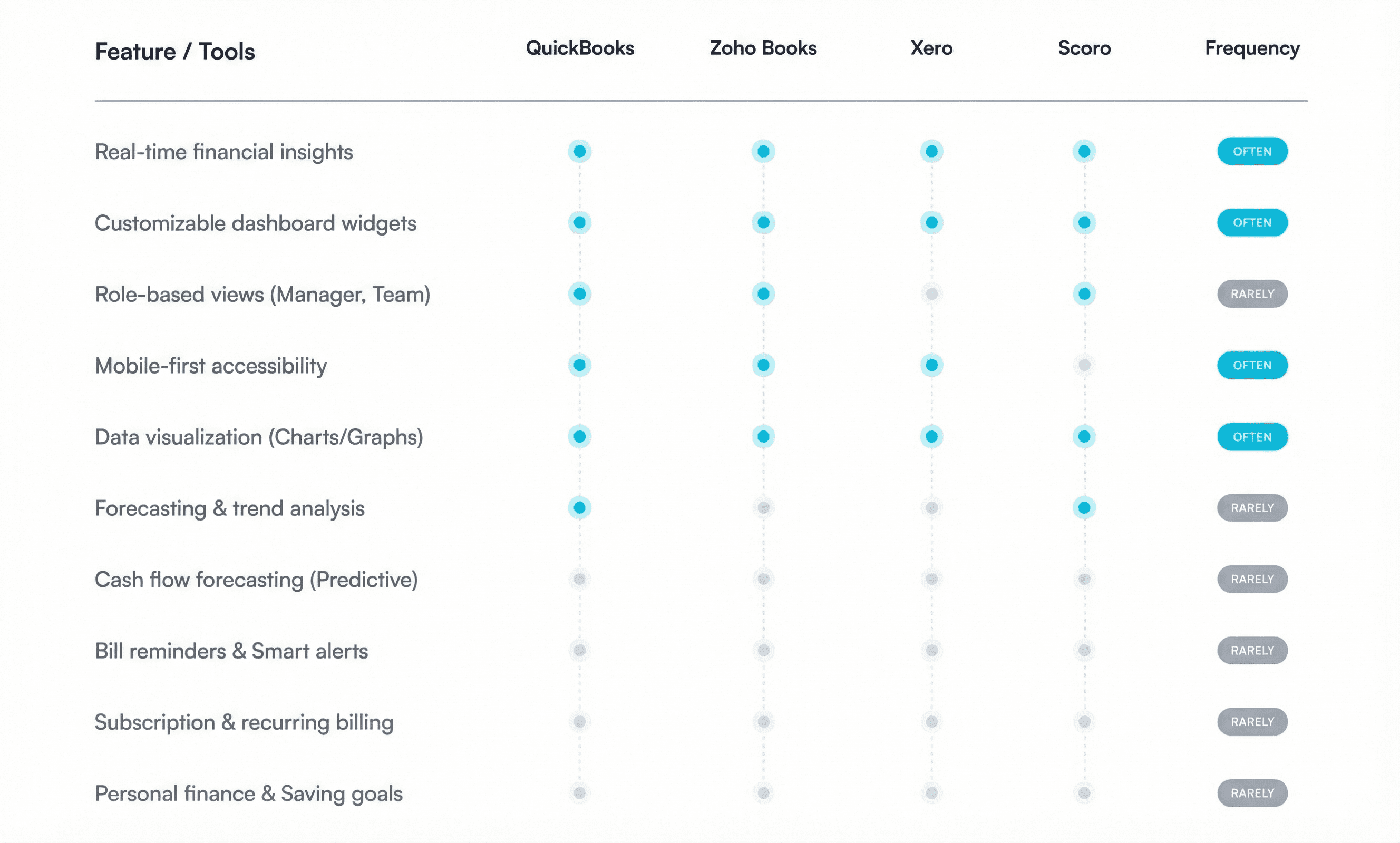
Before sketching a single screen, I audited four leading tools - Zoho Books, Xero, QuickBooks, Frequency and Scoro evaluating each across four dimensions: depth of financial insight, visual clarity, multi-account integration, and personalization capability.
The pattern was consistent: tools built for power users overwhelmed casual users. Tools built for simplicity frustrated anyone with complex needs. The gap between these two worlds became Mintyfi's design opportunity.
The Key Insights
The breakthrough wasn't about adding features. Every tool I analyzed had tried to solve fragmentation by adding more: more charts, more categories, more settings, more notifications. But what users kept describing was the opposite need: they wanted FEWER decisions, not more data.
Tell me what I need to know. Don't make me figure out where to look.
That became the single design principle that shaped every screen: Reduce decisions. Surface what matters. Make the next action obvious.
Design Decisions
Three core decisions, each with a clear rationale and what was discarded.
A fixed information hierarchy, not a fully customizable dashboard
Research showed users spent more time configuring tools than using them. I established a fixed top-level hierarchy (net worth → cash flow → top categories → active goals) that ensures the most critical information is always visible then allowed widget reordering only below the fold. This balances structure with flexibility without overwhelming users with options.
✗ Discarded: A fully drag-and-drop dashboard where every element could be repositioned. Users loved the idea in theory but became paralyzed by choice in testing.Persistent filter chips, not dropdown menus on the Transactions screen
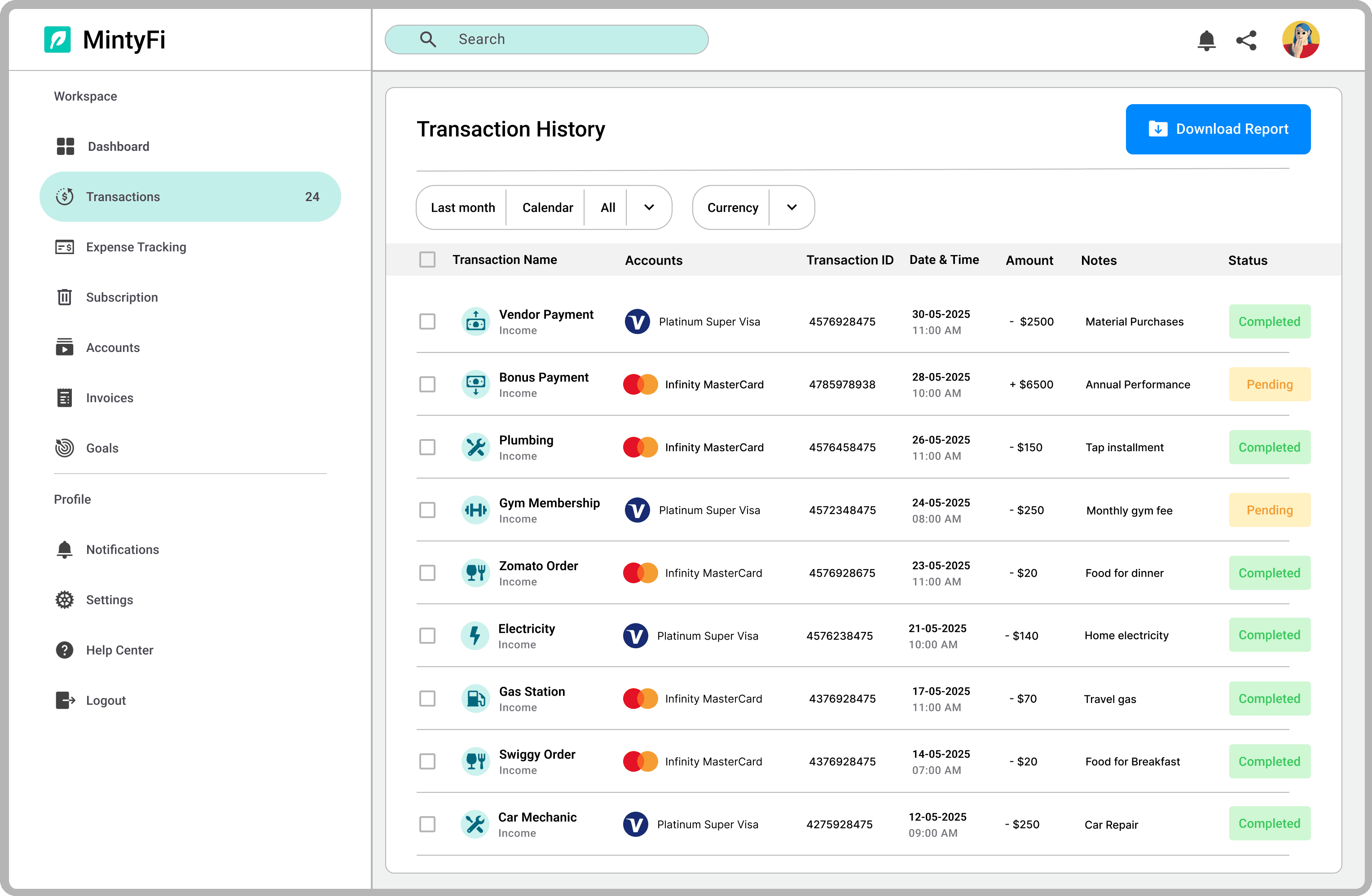
In interviews, filtering was the single most-cited time sink. "I have to click through three menus just to see last month's groceries." I replaced dropdown filters with always-visible, one-tap chips (category, date range, account). This reduced the steps to filter from 4 clicks to 1, and kept active filters visible so users always knew what they were looking at.✗ Discarded: A slide-out filter panel which felt modern but added a navigation layer that disrupted the scanning flow.
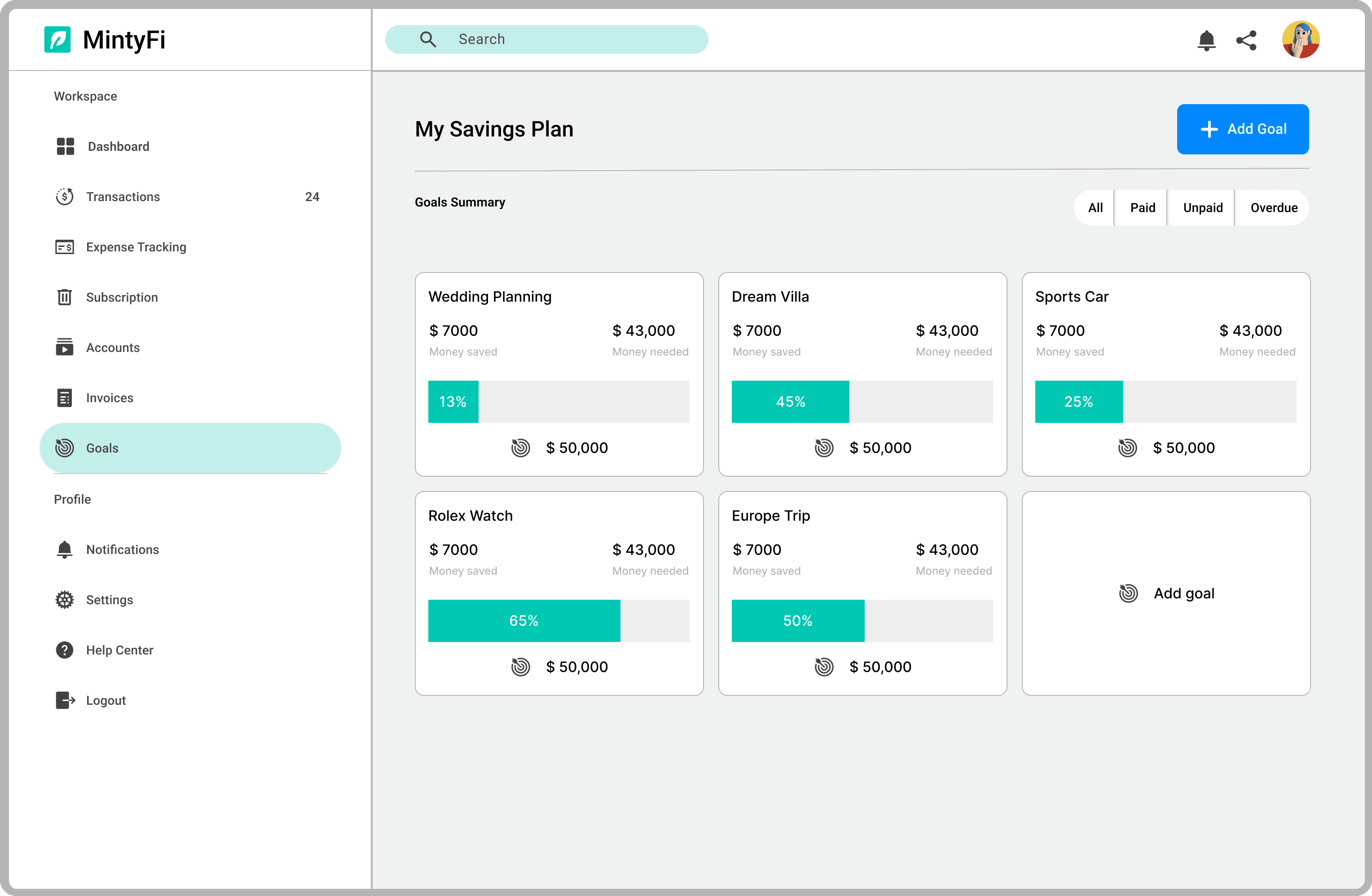
Progress rings for Goals, not percentages or bar charts
Goals tracking failed in every tool I audited because it was buried 3–4 levels deep and displayed only a number. I brought Goals into the main navigation and used a progress ring because circular visual momentum triggers the goal-gradient effect, a behavioral economics principle showing that visual proximity to a goal increases motivation to continue. "You're 73% there" lands differently when you can see you're 73% of the way around the ring.
✗ Discarded: A simple percentage number next to a target amount, accurate, but emotionally inert. Users saw it and felt nothing
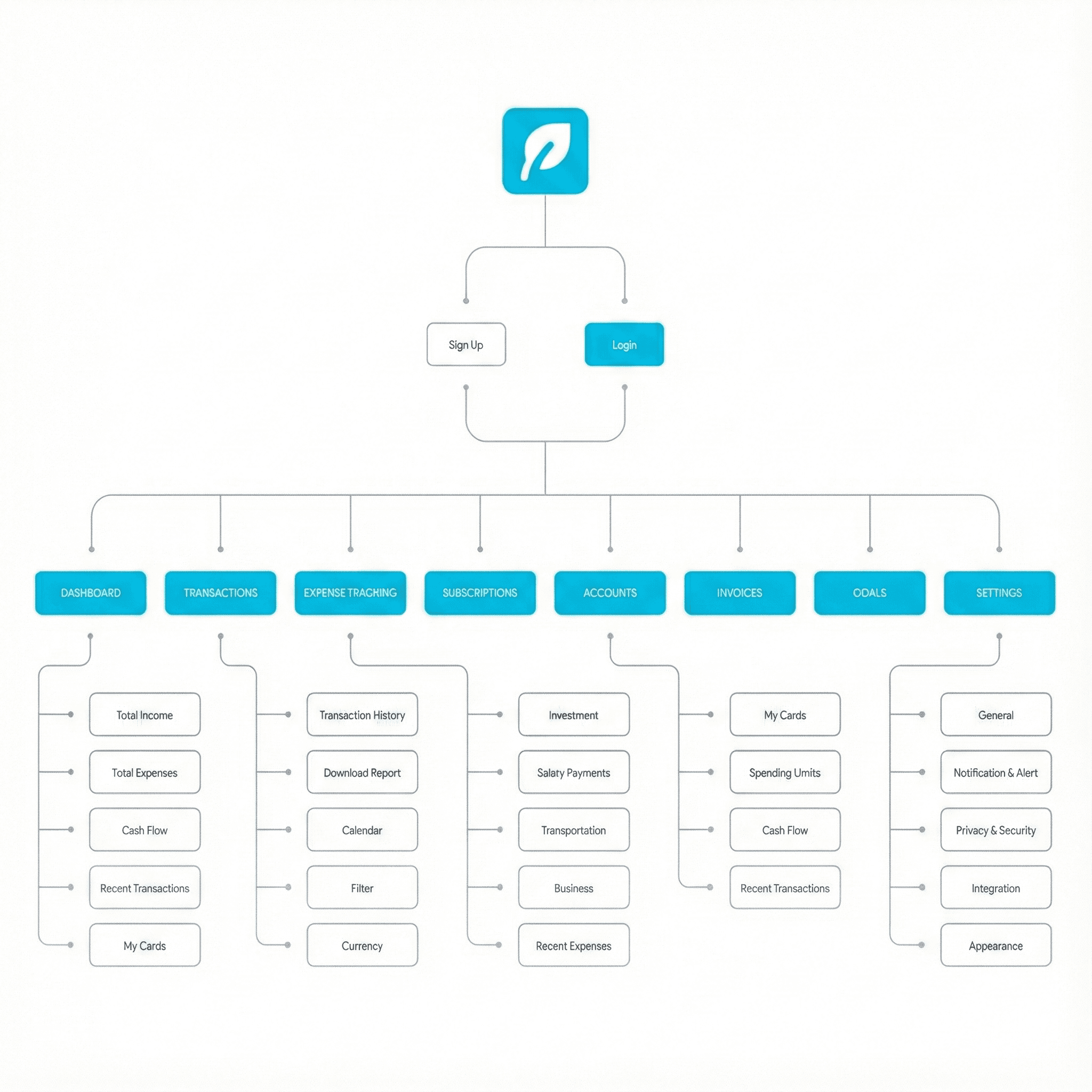
Information Architecture
The Solution
With the core principle - reduce decisions, surface what matters, I designed six interconnected screens, each solving a specific failure mode I'd identified in research. Every design decision on every screen has a direct line back to something a user said, struggled with, or asked for. Nothing was designed because it looked good.
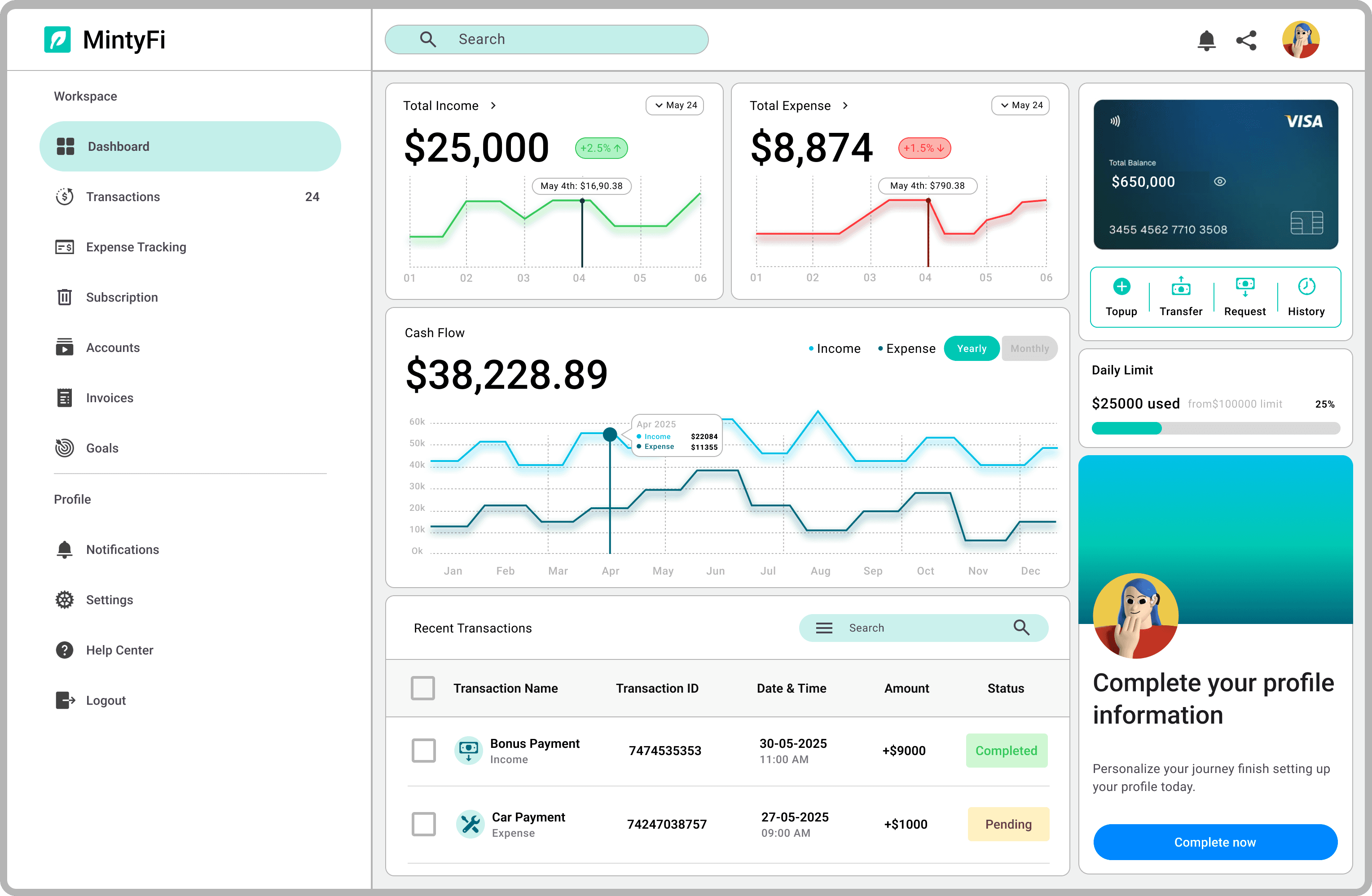
Dashboard
Design decision: Fixed hierarchy + configurable widgets. Top 4 metrics are always visible. Everything below is reorderable but never removable, preventing blank-screen anxiety.
Research evidence:11 of 15 participants said they'd abandoned other dashboards because the first screen "never showed what I actually needed."
Transactions
Design decision: One-tap filter chips replace dropdown menus. Active filters stay visible at all times, no hidden state.
Research evidence: "I have to click through three menus just to see last month's groceries" mentioned by 9 of 15 participants unprompted.
Expense Tracking
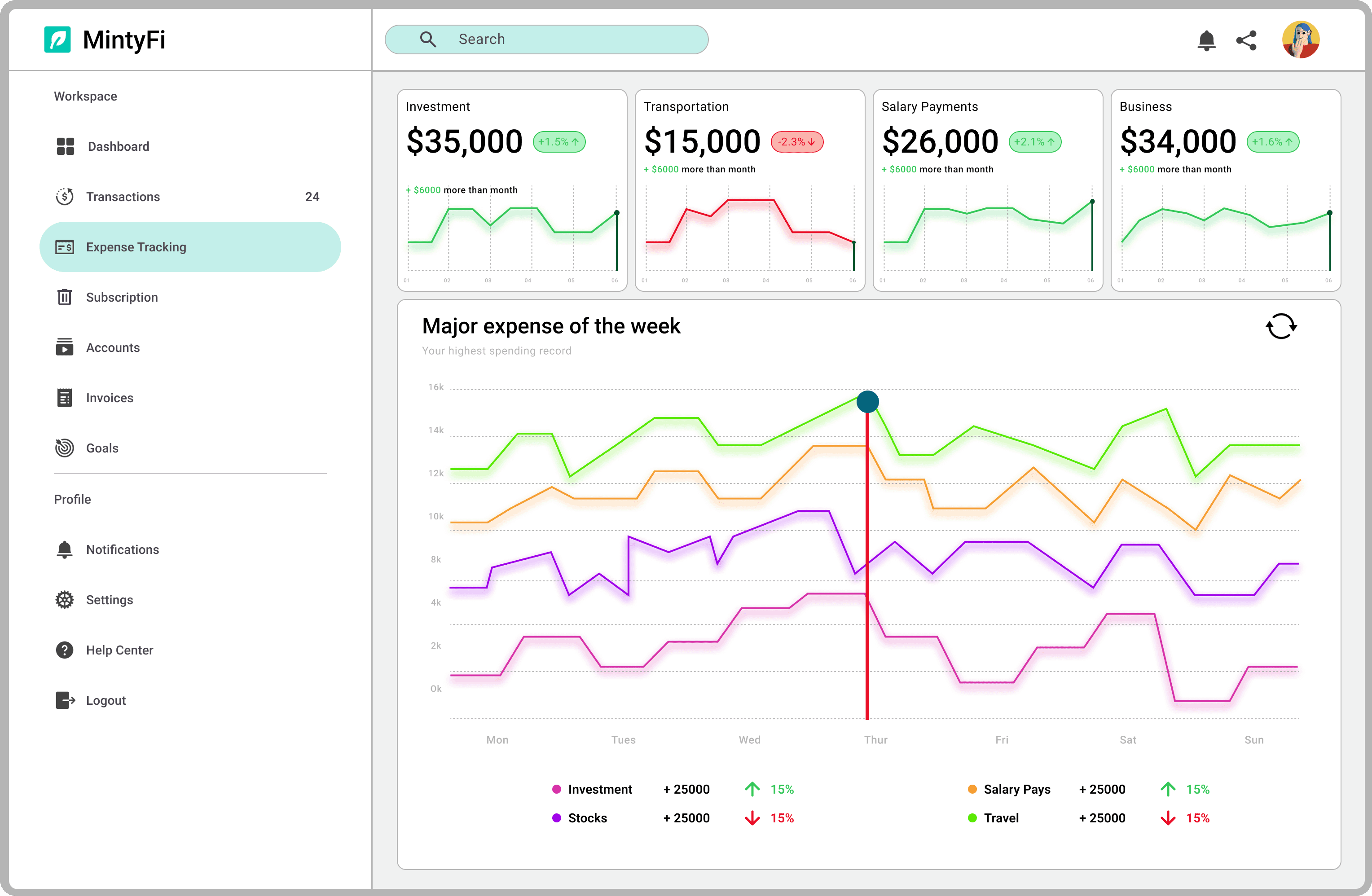
Design decision: Donut (category proportion) + bar chart (trend over time) combination. Neither visualization alone answered both questions users actually had.
Research evidence:Tested 3 visualization approaches. The combination eliminated the need to navigate to a separate analytics section entirely.
Subscriptions
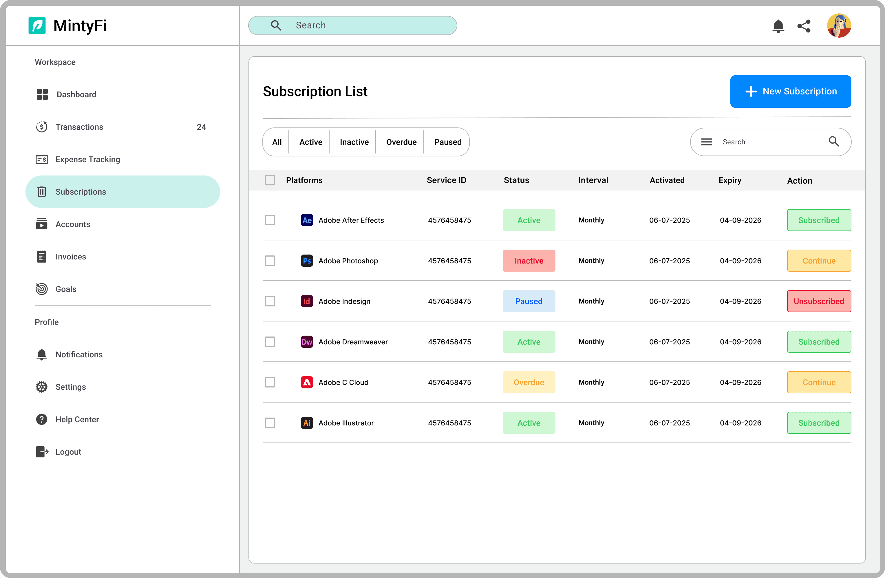
Design decision: "Renews in X days" tag + "inactive" status both direct responses to a specific research finding, not aesthetic choices.
Research evidence: 7 of 15 participants had been surprised by subscription charges they'd forgotten about. "I didn't even know I was still paying for that."
Goals
Design decision: Progress ring (not percentage) in main navigation (not buried). Visual momentum over numerical accuracy.
Research evidence: Behavioral economics: goal-gradient effect. Users who see circular progress are significantly more likely to continue toward completion.
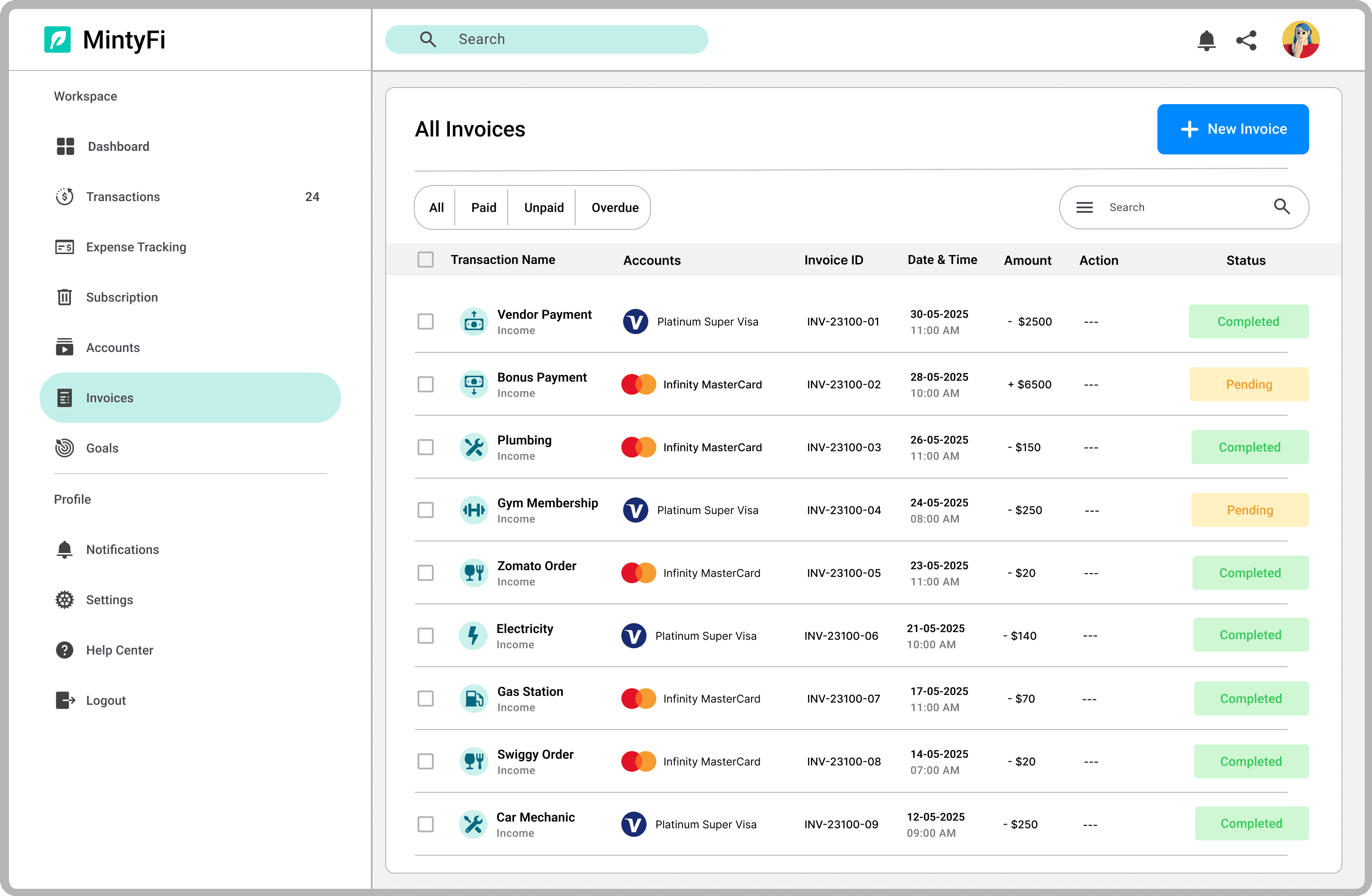
Invoices
Design decision: Status indicators + quick actions in a single row. Designed for the "scan and act" workflow freelancers described.
Research evidence: "I just need to know what's overdue and what I can send a reminder on without opening each one." freelance participant, interview 4.
Usability Testing
With a high-fidelity prototype in Figma, I recruited 18 participants - freelancers, small business owners, and finance managers for moderated usability testing using a think-aloud protocol.
Each 35-minute session covered five core task flows: tracking expenses, managing subscriptions, setting savings goals, reviewing invoices, and reading cash flow at a glance.
I was testing three specific hypotheses based on my design decisions:
Hypotheses 1: The filter chip system reduces time-on-task for transaction filtering vs. a standard dropdown approach.
Hypotheses 2: Progress rings increase perceived motivation for goal tracking compared to numeric-only displays.
Hypotheses 3: The fixed dashboard hierarchy surfaces relevant information within 5 seconds for all three user types.
88% Task success rate - Expense tracking flow
100% Goal-setting success - Validated ring design
78% Requested V2 feature - Cash flow forecasting
What I changed
Testing validated the core decisions but it also surfaced three specific failures I hadn't anticipated:
4 participants misread the budget overview percentage as "percent spent" when it showed "percent remaining." I added an inline label ("of monthly budget remaining") to eliminate the ambiguity.
2 participants with lower vision struggled to read secondary category labels. I increased contrast ratios across all secondary text to meet WCAG AA standards, a change that improved readability for all users, not just those with visual impairments.
The subscription filter dropdown was consistently missed, users didn't discover it in the first 30 seconds. I replaced it with a visible tab system, which increased filter usage from 3 of 18 to 14 of 18 participants in the revised session.
Good usability testing doesn't just validate, it exposes. These three changes made the final design meaningfully better than what I'd built without them.
Reflection
The challenging thing I designed wasn't a screen. It was the dashboard hierarchy.
Every user wanted something different at the top. Every stakeholder I consulted had an opinion. The temptation was to make everything configurable, which is the design equivalent of making no decision at all.
I learned that good information architecture sometimes means making a choice that not everyone agrees with then defending it with evidence. The fixed hierarchy wasn't popular in early feedback. The usability data proved it right.
Finance is also more emotional than I expected. Users didn't just want clarity, they wanted to feel in control of something that often makes them feel powerless. That insight changed how I wrote every label, every status message, every empty state. Tone matters as much as structure.
If I were to continue this project, V2 has a clear direction from the data: cash flow forecasting (requested by 78% of testers) and real-time bank API integration to eliminate manual data entry, the pain point that appeared in 13 of 15 initial interviews. The roadmap isn't a wish list; it's what users told me they needed.